Geen inbreuk modelrecht: They are not as cool
High Court of Justice 9 juli 2012, [2012] EWHC 1882 (Pat) (Samsung tegen Apple)
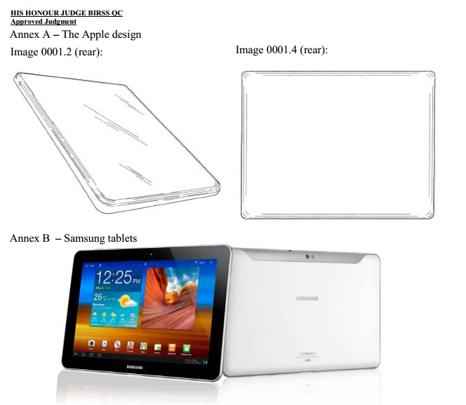
 Modellenrecht. Samsung/Apple in het buitenland, Verenigd Koninkrijk [vergelijk: US District Court California, IEF 11502]. Interessant is het onderdeel waarin de rechter de uitkomst van de Duitse en Nederlandse gerechtelijke procedures afwijst [IEF 10819]. De geïnformeerde gebruiker treft op de achterzijde van de Samsung Galaxy Tablets ongebruikelijke details die de totaalindruk anders maken:
They do not have the same understated and extreme simplicity which is possessed by the Apple design. They are not as cool. The overall impression produced is different.
In de vergelijking van de totaalindrukken concludeert de rechter: They do not have the same understated and extreme simplicity which is possessed by the Apple design. They are not as cool.
The German and Dutch decisions
91. These are Community wide rights and harmony between courts of different member states on issues like this is very desirable. However I find myself in a position in which I respectfully disagree with the assessment of the Dutch Court of Appeal on Stevenson and the German Court of Appeal on Ozolins. These documents form important parts of the design corpus. Ozolins played a significant role in both decisions, especially the German decision, and Stevenson was important in the Dutch decision. Given these areas of disagreement and given their preliminary character, I will not place reliance on the German or Dutch decisions nor will I make this judgment longer than it already is by analysing those decisions in detail.
Totaalindruk van Apple Design: voorkant / cool design
181. Viewed without the design corpus, the appearance of the front surface of the Apple design would be given significant importance but that significance is reduced by the presence of identical features in the design corpus. The Apple design has a relatively thin profile but not excessively so. If the product was roughly 25cm long (c.f. the Tab 10.1) it would be about 1.5cm thick, comparable to the thickness of a finger.
182. The extreme simplicity of the Apple design is striking. Overall it has undecorated flat surfaces with a plate of glass on the front all the way out to a very thin rim and a blank back. There is a crisp edge around the rim and a combination of curves, both at the corners and the sides. The design looks like an object the informed user would want to pick up and hold. It is an understated, smooth and simple product. It is a cool design.
De totaalindrukken vergeleken:
189 This case illustrates the importance of properly taking into account the informed user's knowledge and experience of the design corpus. When I first saw the Samsung products in this case I was struck by how similar they look to the Apple design when they are resting on a table. They look similar because they both have the same front screen. It stands out. However to the informed user (which at that stage I was not) these screens do not stand out to anything like the same extent. The front view of the Apple design takes its place amongst its kindred prior art. There is a clear family resemblance between the front of the Apple design and other members of that family (Flatron, Bloomberg 1 and 2, Ozolins, Showbox, Wacom). They are not identical to each other but they form a family. There are differences all over these products but the biggest differences between these various family members are at the back and sides. The user who is particularly observant and is informed about the design corpus reacts to the Apple design by recognising the front view as one of a familiar type. From the front both the Apple design and the Samsung tablets look like members of the same, pre-existing family. As a result, the significance of that similarity overall is much reduced and the informed user's attention to the differences at the back and sides will be enhanced considerably.
190. The informed user's overall impression of each of the Samsung Galaxy Tablets is the following. From the front they belong to the family which includes the Apple design; but the Samsung products are very thin, almost insubstantial members of that family with unusual details on the back. They do not have the same understated and extreme simplicity which is possessed by the Apple design. They are not as cool. The overall impression produced is different.


