Alle rechtspraak  

IEF 7070

Uitspraak volgt

Hoge Raad, 12 september 2008, LJN: BF0518, Conclusie A-G Verkade in Portakabin Limited c.s tegen Primakabin BV

Eerst even voor jezelf lezen. Merkenrecht en ‘Adwords’ (zoekwoorden voor internetzoekmachines). Art. 2.20 en 2.23 Benelux-Verdrag Intellectuele Eigendom; art. 5, 6 en 7 Merkenrichtlijn 89/104/EEG. Prejudiciële vragen aan Hof van Justitie van de EG over de vraag of het opgeven van andermans merk als zoekwoord merkgebruik in de zin van één van de categorieën van art. 5 van de Richtlijn oplevert, en of daarbij de uitzonderingen van art. 6 en 7 van toepassing kunnen zijn. 

Lees de conclusie hier.

IEF 7068

Jij moet betalen. Betalen jij!

Mr. SchoneleijRechtbank ’s-Gravenhage, 6 augustus 2008, KG RK 08/1331, Schoone Lei Incassodiensten B.V. tegen Coöperatieve Centrale Raiffeisen-Boerenleenbank B.A., handelend onder de naam ‘Rabobank Nederland’

Ex parte beschikking. Merkenrecht. Handelsnaamrecht. Interactieve reclame van Rabobank.  Door gebruik van het teken ‘Meester Schoneleij’ ( een zeer dubieuze incasseerder) op de website www.schoneleij.nl, het gebruik van de naam ‘Meester Schoneleij’ in de commercial op de website www.schoneleij.nl, het gebruik van de domeinnaam schoneleij.nl en het gebruik van het Google Ad-Word ‘Schoone Lei’ zou Rabobank inbreuk maken op het exclusieve merkrecht van Schoone Lei. Verzoek afgewezen, geen gebruik voor waren of diensten, geen onderneming, geen evident ongerechtvaardigd voordeel of reputatieschade.

 “2.2. De voorzieningenrechter is van oordeel dat het verzoek niet in overeenstemming is met de aan de onderbouwing van een ingrijpende maatregel als een ex parte verbod te stellen hoge eisen, in het bijzonder ten aanzien van de aannemelijkheid van de gestelde inbreuk. Voorshands is niet aannemelijk dat het teken Meester Schoneleij (op welke wijze dan ook) wordt gebruikt ter onderscheiding van waren of diensten dan wel dat onder deze naam een onderneming wordt gedreven. Artikel 2.20 lid 1 en onder b BVIE en de artikelen 5 en 5a Handelsnaamwet kunnen om die reden dus niet als grondslag in aanmerking worden genomen. Mede gelet op het parodiërend karakter van de commercial staat voorts niet buiten twijfel dat in het onderhavige geval ongerechtvaardigd voordeel wordt getrokken uit dan wel afbreuk wordt gedaan aan de reputatie van het merk. Ook op grond van artikel 2.20 lid 1 en onder d BVIE kan de gevraagde voorziening derhalve niet worden toegewezen.”

Lees de beschikking hier

IEF 7064

In elkaar geknutseld

Peter DonkerslootRechtbank Amsterdam 10 september 2008, HA ZA 03-1002, Peter Donkersloot tegen Va Roij c.s. (met dank aan Rutger Kleemans en Theo Blomme, Freshfields Bruckhaus Deringer).

Twee vonnissen gewezen door de rechtbank Amsterdam op 19 april 2006 (tussenvonnis: bewijsopdracht) en 10 september 2008 (eindvonnis). De zaak betreft auteurs-, merken en handelsnaamrecht alsmede contractenrecht (het beëindigen van een (agentuur)overeenkomst tussen kunstenaar en galeriehouder).
 
Na het tussenvonnis ging de vraag grotendeels over de authenticiteit van een verklaring waarin de kunstenaar Peter Donkersloot al zijn auteursrechten aan de galeriehouder zou hebben overgedragen.

“2.8 (…) De vordering “Ten aanzien van de auteursrechten” onder 2. in het tussenvonnis van 19 april 2006, die zich uitsluitend tot Van Roij richt, is toewijsbaar voorzover die er toe strekt voor recht te verklaren dat Van Roij geen rechten kan ontlenen aan de 97-verklaring. Vast is immers komen te staan dan die verklaring buiten medeweten van Donkersloot in elkaar is geknutseld op de wijze als hiervoor omschreven, teneinde aldus een niet bestaande overdracht van auteursrechten te suggereren. Er is op dit punt geen overeenstemming tussen Donkersloot en Van Roij tot stand gekomen, zodat voor nietigverklaring van d e97-verklaring – die immers geen (al dan niet gebrekkige) wilsuiting van Donkersloot behelst – geen aanleiding is”

Lees het eindvonnis hier, het tussenvonnis hier en de verklaring hier.

IEF 7061

Une très forte similitude

GvEA, 10 september 2008, zaak  T-96/06, Tsakiris-Mallas AE  tegen OHIM / Late Editions Ltd. (Nederlandse vertaling nog niet beschikbaar).

Merkenrecht. Oppositieprocedure op grond van eerder nationaal Brits woordmerken EXE, voor kleding, tegen aanvraag gemeenschapsbeeldmerk exe (met liggend streepje op de laatste e), eveneens voor kleding. Oppositie toegewezen.

33. En conséquence, c’est à bon droit que la décision attaquée, ayant pris en considération tous les éléments pertinents au cas d’espèce, a estimé que les « articles en cuir, sacs, portefeuilles » visés par la demande de marque communautaire avaient des caractéristiques communes avec les « vêtements, à l’exception des chaussures » couverts par la marque antérieure, de sorte que l’existence d’un risque de confusion ne pouvait être écartée sur le fondement d’une simple appréciation des produits en cause.

(…) 35. Il y a lieu de relever que, ainsi qu’il a été constaté au point 24 de la décision attaquée, les éléments verbaux « exe » et « exe» [met liggend streepje -IEF] présentent incontestablement une très forte similitude sur le plan visuel, puisqu’ils sont constitués des mêmes lettres, dans le même ordre. Ils ne se distinguent que par un trait horizontal qui, étant placé juste au-dessus de la lettre finale du signe demandé, n’est pas particulièrement perceptible sur le plan visuel. Quant au fait que l’élément verbal de la marque demandée est présenté en lettres minuscules d’imprimerie, il y a lieu de relever, à l’instar de l’OHMI, que le droit antérieur est une marque verbale et que, dès lors, il peut être présenté également en lettres minuscules. La présence d’un élément figuratif dans la marque demandée, à savoir le fond noir ressemblant à un rectangle légèrement arrondi, ne joue, eu égard à son caractère assez simple et banal, qu’un rôle très secondaire dans la perception du signe et ne saurait donc constituer un élément de différenciation suffisant des deux signes en conflit.

(…) 38. En conséquence, c’est à bon droit que la décision attaquée a considéré que les signes comparés présentaient globalement un degré de similitude élevé, en raison, d’une part, de leur forte similitude visuelle et, d’autre part, de leur identité phonétique et conceptuelle.

40. En l’espèce, eu égard, d’une part, au caractère similaire des produits en cause et au degré élevé de similitude entre les signes en conflit et compte tenu, d’autre part, de l’interdépendance de ces deux facteurs dans le cadre d’une appréciation globale du risque de confusion, c’est à bon droit que la chambre de recours a conclu à l’existence d’un tel risque entre les marques en conflit.”

Lees het arrest hier.

IEF 7060

High & low degrees

GvEA, 10 september 2008, zaak  T-48/06, Astex Therapeutics Ltd tegen OHIM / Protec Health International Ltd , (Nederlandse vertaling nog niet beschikbaar).
Merkenrecht. Oppositieprocedure op grond van eerder gemeenschapswoordmerk ASTEX, voor, kort gezegd, huisstofmijtbestrijdingsmiddelen, tegen aanvraag gemeenschapsbeeldmerk astex TECHNOLOGY, voor pharmaceutische producten. Oppositie toegewezen. Hoge graad van overeenstemming van de tekens neutraliseert de lage graad van soortgelijkheid met betrekking tot de waren.

“57. From a visual point of view, with regard to whether the word ‘astex’ is likely on its own to dominate the image of the trade mark which the relevant public will recall and thus constitute the dominant element of the mark applied for, it must be pointed out that it occupies a central position in that mark and that the letters composing it are significantly larger than those employed for the word ‘technology’. The Court agrees with the analysis of the Board of Appeal that the word element ‘technology’ in the mark applied for, written in much smaller typeface, will not attract consumers’ attention. Although it is true that the figurative element representing a stylised letter ‘a’ is placed very visibly on the left of the sign applied for, it does not, however, seem likely to attract the consumer’s attention to the point that he would recall it. It is unlikely that the relevant public would notice in all cases that this figurative element represents the letter ‘a’ since the image is stylised and could be confused with a triangle or an object in the form of a pyramid, all the more so as the letter ‘a’ of the word element ‘astex’ is also present in the word element of the mark applied for and thus seems redundant. In addition, the letter ‘a’, stylised in triangular form and presented in the middle of a circle, is not a special or original configuration which could lead to the identical nature of the common word element dominating the two marks being reduced to such an extent that the overall impression provided by each sign is different. Consequently, the word element ‘technology’ and the letter ‘a’ must be regarded as negligible.

(…) 59. Finally, with regard to the assessment of conceptual similarity, it is true, as the applicant claims, that the Board of Appeal did not take account of the conceptual value of the stylised element in the figurative mark applied for. The Board of Appeal merely denied the semantic value of the term ‘astex’ and denied that the word ‘technology’ had a distinctive character.

60. The Board of Appeal’s analysis is none the less well founded. The concept of technology, to which the word element ‘technology’ refers, is commonly defined very broadly, as meaning the development and perfection of methods permitting the effective use of various techniques with a view to making production, consumption and information mechanisms function. It is thus certain that, in regard to all the goods covered by the trade mark application, the reference to technology is not of such a nature as to give the mark applied for a distinctive character.

(….) 62. Only the stylised element could call into question the conceptual similarity of the signs at issue. It is sufficient to note, in that regard, that the significance of that element is far from clear, inasmuch as it may be regarded as a stylised letter ‘a’ or, equally, as a triangle or an object in the form of a pyramid. Moreover, the applicant does not express a view as to the significance to be accorded to the figurative element.

63. Consequently, the signs at issue must be regarded as being very similar overall.

(…) 70. In the present case, bearing in mind the distinctive character of the earlier mark resulting from the use of an original term which has no precise meaning in any language of the European Community, something which the applicant does not contest, the Board of Appeal rightly considered that the high degree of similarity between the signs at issue was such as to offset the low degree of similarity between the goods at issue.

71. In particular, the similar intended purpose of the products, both of which are of interest to persons suffering from respiratory problems related to allergic reactions to dust mites, and the high degree of similarity between the marks at issue, justify the Board of Appeal’s assessment that the relevant public is likely to believe that the goods bearing the signs at issue come from the same undertaking or from undertakings that are economically linked.

72. In the light of the foregoing, it must be held that the Board of Appeal was right to conclude that there was a likelihood of confusion between the two marks at issue."

Lees het arrest hier

IEF 7059

During the same, very specific surgical operation

GvEA, 10 september 2008, zaak  T-325/06, Boston Scientific Ltd tegen OHIM / Terumo Kabushiki Kaisha (Nederlandse vertaling nog niet beschikbaar).

Merkenrecht. Oppositieprocedure op grond van eerder nationale woordmerken CAPIOX, voor, kort gezegd, medische apparatuur, tegen aanvraag gemeenschapswoordmerk CAPIO  (‘apparatus for placing a suture’). Complementaire waren, overeenstemmende tekens. Normaal gebruik in verhouding tot de aard van de waar en de markt. Oppositie toegewezen.

“49. It is true that, although such sales during the relevant period cannot be considered to be significant in terms of volume, the data must be viewed in relation to the nature of the goods, namely hollow fiber oxygenators with detachable hard-shell reservoir, which are extremely specialised products. According to the findings in the opposition decision, which were not contested by the intervener and which were expressly approved by the applicant in its application, ‘an oxygenator is a device that mechanically oxygenates venous blood extra corporeally and is used in combination with one or more pumps for maintaining circulation during open heart surgery and for assisting the circulation in patients seriously ill with some cardiac and pulmonary disorders’. That definition clearly shows that oxygenators are very specific products.

50. In addition, notwithstanding the regrettable lack of objective and tangible data concerning the structure of the relevant market, it is clear that, in the light, precisely, of the nature of the goods concerned, referred to in the previous paragraph, such a market cannot but be narrow.

51. Finally, the number of transactions involving the goods concerned during the relevant period does not appear to be a token amount and therefore does not permit the view to be taken that the intervener used the CAPIOX trade mark for the sole purpose of preserving the rights conferred by the trade mark. On the contrary, such use must be viewed as warranted, in the economic sector concerned and in the light of the nature of the goods concerned, in order to maintain or create a share in the market for the goods protected by the mark for the purposes of the case-law referred to in paragraphs 29 to 32 above.

(…) 95. The similarity between the signs at issue cannot be called into question on the ground that use of the letter ‘x’ is not common in Finland. Even if it were the case, as the Opposition Division stated, that the letter ‘x’ was seldom used in Finnish, that cannot have the effect of eliminating the similarity between the signs, because, as the Board of Appeal rightly pointed out in paragraph 27 of the contested decision, the medical field is highly internationalised and numerous trade marks that include the letter ‘x’ coexist in it.

96 (…) Consequently, the Board of Appeal was right to find that the conflicting signs had a high degree of similarity.

99. (…) the overall impression produced by the conflicting signs is likely to render them sufficiently similar to lead to a likelihood of confusion in the minds of the relevant public.

(…) 101. In that respect, it must be pointed out that even though the goods at issue lack a high degree of similarity that is offset by the very high degree of similarity between the signs, particularly as the earlier trade mark is an invented word that does not allude, directly or indirectly, to the goods concerned. Since the trade mark CAPIOX is a made-up word, it therefore has a very distinctive character as OHIM rightly observed. (…)

102. (…) even a public made up of specialists with a high degree of attention might, when confronted with the goods at issue, either not notice the difference resulting from the absence of the letter ‘x’ on goods bearing the trade mark applied for or think that the goods nevertheless originate from the same undertaking, which affixes a trade mark to some of its goods that is practically identical to the one it affixes to other of its goods. It is clear that the mere possibility mentioned above that the goods at issue could be used during the same, very specific surgical operation, namely open-heart surgery, shows that there is a genuine likelihood that a public, even one made up of professionals, could believe that the goods came from the same undertaking.”

Lees het arrest hier.

IEF 7058

Hochgradigen Ähnlichkeit (woord)

GvEA, 10 september 2008, zaak  T-300/06, Promat GmbH tegen OHIM / Puertas Proma (Nederlandse vertaling nog niet beschikbaar).

Merkenrecht. Oppositieprocedure op grond van eerdere gemeenschapsbeeldmerken PROMA tegen aanvraag gemeenschapswoordmerk PROMAT (beide ingeschreven voor, kort gezegd, bouwmaterialen). Oppositie gedeeltelijk toegewezen. Zaak is vrijwel identiek aan het hieronder (T-243/06, IEF 7057) vermelde geschil tussen partijen. I.c. betreft het echter een oppositie tegen het woordmerk PROMA, terwijl de oppositie hieronder betrekking heeft op het de aanvraag voor een beeldmerk. Redenering van het Gerecht en de uitkomst zijn vrijwel hetzelfde.

„52. Auf der Grundlage der vorstehenden Erwägungen ist festzustellen, dass der einzige Klagegrund eines Verstoßes gegen Art. 8 Abs. 1 Buchst. b der Verordnung Nr. 40/94 nicht begründet ist. Die Beschwerdekammer durfte unter Heranziehung des Grundsatzes der Wechselwirkung zwischen den Zeichen und den Waren bei der Beurteilung der Verwechslungsgefahr annehmen, dass angesichts der hochgradigen Ähnlichkeit sowohl der betreffenden Waren als auch der betreffenden Zeichen, insbesondere, was die fast vollständige Übereinstimmung der Wortbestandteile „promat“ und „proma“ angehe, die Unterschiede zwischen den Zeichen nicht ausreichten, um bei den maßgeblichen Verkehrskreisen eine Verwechslungsgefahr auszuschließen.“

Lees het arrest hier.

IEF 7057

Hochgradigen Ähnlichkeit (beeld)

GvEA, 10 september 2008, zaak  T-243/06, Promat GmbH tegen OHIM / Puertas Proma (Nederlandse vertaling nog niet beschikbaar).
Merkenrecht. Oppositieprocedure op grond van eerdere gemeenschapswoordmerken PROMA tegen aanvraag gemeenschapsbeeldmerk PROMAT (beide ingeschreven voor, kort gezegd, bouwmaterialen). Oppositie gedeeltelijk toegewezen.

„54. (…) Die Beschwerdekammer durfte unter Heranziehung des Grundsatzes der Wechselwirkung zwischen den Zeichen und den Waren bei der Beurteilung der Verwechslungsgefahr annehmen, dass angesichts der hochgradigen Ähnlichkeit sowohl der betreffenden Waren (mit Ausnahme der „transportable[n] Bauten aus Metall; Baustellensicherungen und Zäune; Maschinen- und Garderobenschränke; Trennscheiben) als auch der betreffenden Zeichen, insbesondere was die fast vollständige Übereinstimmung der Wortbestandteile „promat“ und „proma“ angehe, die Unterschiede zwischen den Zeichen nicht ausreichten, um bei den maßgeblichen Verkehrskreisen eine Verwechslungsgefahr auszuschließen.

45. (…) Der Begriff „proma“ sei daher das dominierende Element der älteren Gemeinschaftsmarke. Folglich bestehe ein gewisser Grad an visueller Ähnlichkeit zwischen den beiden Marken, denn der Wortbestandteil der älteren Gemeinschaftsmarke PROMA werde in der angemeldeten Marke PROMAT vollständig wiedergegeben.

46. Im vorliegenden Fall weisen die Bildbestandteile der beiden Marken keine individuelle und originelle Gestaltung auf, die bei der visuellen Wahrnehmung eine wichtige Rolle spielen würde und sie unterscheiden könnte. Daher sind sie als vernachlässigbare Bestandteile anzusehen.

(…) 50. Der Buchstabe „t“, der in der älteren Gemeinschaftsmarke fehlt, kann nämlich – unabhängig davon, ob er vom Verbraucher ausgesprochen wird oder nicht – nicht als ein besonders markanter Konsonant angesehen werden, der den klanglichen Eindruck der Anmeldemarke wesentlich beeinflussen könnte.

52 In begrifflicher Hinsicht ist die Beschwerdekammer zutreffend davon ausgegangen, dass der Umstand, dass die Wortbestandteile der Marken beide erfundene Wörter seien, keinen Einfluss auf den umfassenden Markenvergleich habe.

53. Daher ist im Ergebnis von einer hochgradigen Ähnlichkeit der beiden Zeichen nach Bild und Klang auszugehen.“

Lees het arrest hier.

IEF 7056

Geel puntje

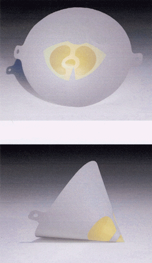
Klik voor vergrotingGvEA, 10 september 2008, zaak  T-201/06, Louis M. Gerson Co., Inc tegen OHIM (Nederlandse vertaling nog niet beschikbaar).

Merkenrecht. Weigering op absolute gronden van  3D gemeenschapsmerk  “Paint filter partly coloured yellow”. Beroep afgewezen: geen onderscheidend vermogen. Decoratief en niet orgineel. Freihaltebedürfnis kleurgebruik.

“23. In the present case, as regards the shape of the mark applied for, it must be stated that it is very similar to competing goods on the market. Even if each manufacturer produces different filters, the three-dimensional shape in respect of which registration was applied for is a simple shape which is amongst those which come naturally to the mind of the consumer in relation to paint filters. As the Board of Appeal rightly found at paragraph 17 of the contested decision, the shape at issue does not have any element that can be said to depart perceptibly from one of the most common shapes of such a product.

24. Next, as regards the use of the colour yellow near the tip of the filter, it must be observed that that is not sufficient to warrant the conclusion that the mark applied for enables the average consumer to distinguish the product concerned from those of other undertakings without conducting an analytical examination and without paying particular attention. Thus, the applicant’s argument that the colour would be noticed by users who would therefore identify the trade origin of the product (see paragraph 11 above) cannot be accepted. On the contrary, as the Board of Appeal states at paragraph 17 of the contested decision, the use of the colour yellow will be perceived as indicating the tip or as a decorative element, but not as a distinctive element. The use of the colour might possibly serve to distinguish between the quality or the size of different models of the same product, but is not distinctive as regards its trade origin.

(…) 26. Moreover, even were it the case, as the applicant asserts, that the consumer was a specialist and could be expected to know that only the applicant produced coloured paint filters, the distinctive character of the mark resulting from the application of a colour on the goods could not be accepted. That argument entails registration of the mark being based not on the use of the colour yellow in particular, but on the mere application of a colour on goods. In such circumstances, registration would unduly restrict the availability of colours for competitors, who might wish to use them on their own goods.”

Lees het arrest hier.

IEF 7055

Eindigt op visc

GvEA, 10 september 2008, zaak  T-106/07, Alcon Inc tegen OHIM / *Acri.Tec AG (Nederlandse vertaling nog niet beschikbaar).

Merkenrecht. Oppositieprocedure op grond van eerdere internationale woordmerken PROVISC en DUOVISC tegen aanvraag gemeenschapswoordmerk BioVisc (beide ingeschreven voor, kort gezegd, oogheelkundige produkten ). Oppositie afgewezen, geen verwarringsgevaar.

“38. Furthermore, the applicant does not put forward any specific argument as regards its claim that the dominant element of the marks at issue is ‘visc’.

39. Accordingly, the Court holds that the differences between the signs at issue resulting from the difference in their prefixes is sufficient to rule out a visual similarity and to distinguish them phonetically.

(…) 42. It is clear from the foregoing that the signs at issue have different conceptual meanings which the relevant public can perceive and understand. Consequently, it must be held that there is a conceptual difference between the signs at issue.

43. In the light of the foregoing, in the overall assessment of the marks at issue, the Board of Appeal rightly held, in the contested decision, that the visual, phonetic and conceptual difference of the signs at issue were sufficient, in spite of the identity of the goods concerned, to preclude the similarities between the signs at issue from giving rise to a likelihood of confusion on the part of the specialist Community consumer as to the commercial origin of the goods concerned.”

Lees het arrest hier.